October 16, 2026
Futura on your website
FormX speaks Futura. It is the typeface of their brand, so naturally they wanted it on their website too. The question was: how do you put Futura on a website legally?
Futura is available through Typekit (now Adobe Fonts), which comes with a Creative Cloud subscription of about €240 a year. That is a bargain. But Typekit serves the font from Adobe’s servers, which means every visitor’s IP address goes to Adobe. A German court ruled that doing this with Google Fonts violates the GDPR, and Adobe is no different. And in Adobe’s case, you cannot simply download the font and host it yourself: the Adobe Fonts EULA does not allow that. So Typekit is out.
So you need to host Futura yourself, with a web licence from Monotype. That licence is priced by traffic: at 1 million pageviews a month, one style costs about €800 a year. FormX has twice that traffic and needs several styles, so that is well over €5,000 a year. And how does Monotype count your pageviews? With a required tracking call on every page, which sends each visitor’s IP address to a third party. That is the same GDPR problem as with Typekit.
The only option left is to abandon Futura and use the look-alike Jost, made by Indestructible Type. It is released under the SIL Open Font License. That licence does not just allow you to use the font for free: it allows you to change it, as long as you keep the licence with it and do not sell the font on its own.
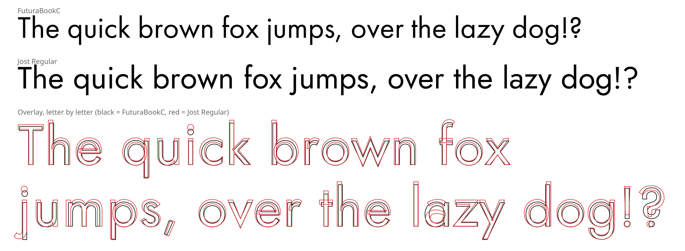
Jost was close to Futura (and only one ‘o’ away from my own name), but not close enough. Put the two on top of each other and you see the differences: Jost is bigger, its x-height is higher, its ‘a’ has two storeys, the ‘u’ has a stem and the ‘j’ has a hook. Therefore I used Futura as a measuring tape. For each weight I measured the x-height, the cap height, the ascenders and descenders, the stem width and the space around every letter. Then I picked the Jost weight with the same stem width, scaled it to Futura’s x-height and stretched the ascenders and descenders to Futura’s. Note that not a single outline of Futura was copied! Every curve in the new font comes from Jost, or was drawn by me.
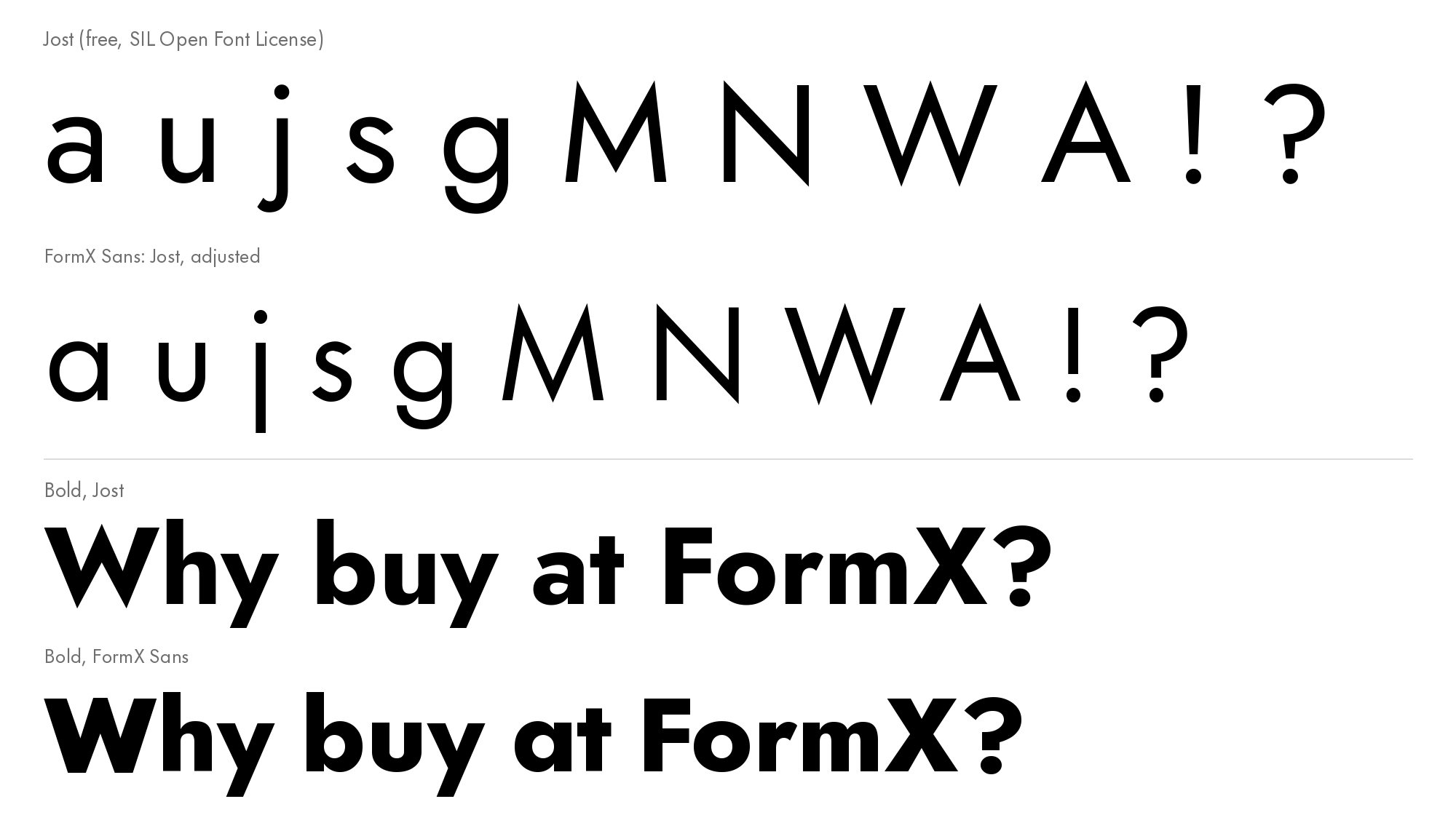
Some letters needed more than measuring. Those I rebuilt from Jost’s own parts:
- the single-storey ‘a’ is Jost’s ’d’ with the stem cut off
- the ‘u’ is a simple U-shape without a stem
- the ‘j’ is a straight stem without a hook
- the ‘M’ and ‘N’ are drawn in Futura’s style, with splayed legs
- the ’s’ got shorter ends and stands a bit more upright
- the ‘g’ has a shorter, narrower tail
- in the bold weights the points of the A, V, W, v and w are cut flat, as in Futura
The result is called FormX Sans. It is one variable font from Light to Bold, plus an italic. That is two small woff2 files (about 88KB each), replacing the eighteen separate Jost files the site had before. It is hosted on FormX’s own server, so it is fully GDPR compliant. I also gave it a new name, so nobody mistakes it for Jost.
How close did I get? I compared it to a public domain Futura specimen… and here is the result:
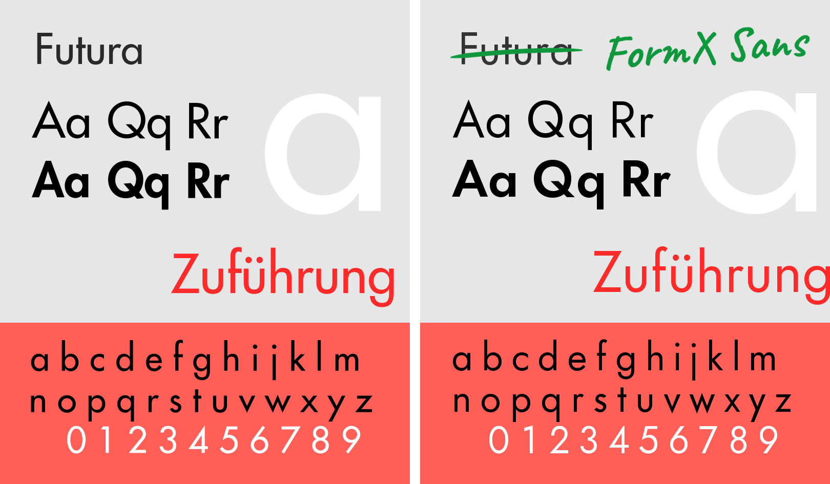
The left one is Futura, the right one is FormX Sans. It is not identical, but it is close enough, and more important: perfectly legal to use. Like Jost, FormX Sans stays under the SIL Open Font License.
So if you love a commercial font: look for an open font that comes close, and adjust it. That costs you some time, but it is worth it.
Happy coding!
() Joost van der Schee